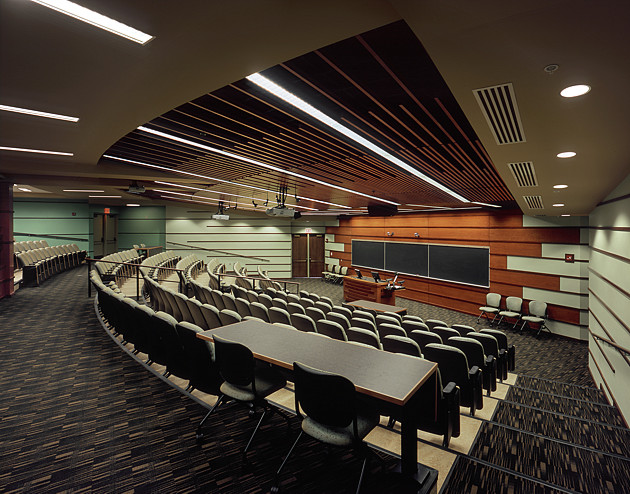
When making an architectural photograph, one of my main goals is to emphasize the artfulness of the design: the colors, textures, materials, rhythms, harmonies, lines, massing of forms, etc. In doing so, I try to create images that are, in themselves, artful. Another consideration is that the images should "read" well at all scales, from a print on the wall down to a "thumbnail" on a Web page. I feel this image illustrates that point, in that the composition is strong and balanced, while giving a sense of the purpose of the space and how people interact with it. |