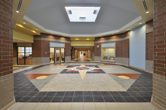
Usually, I try to create compositions that are "dynamically balanced" -- that have visual energy and imply a sense of motion. This not only results in images that are engaging to the eye, but relates to how people relate to most architecture. But there are situations that are inherently symmetrical and which call for a more settled, centered interpretation, such as the image above. In such cases I will pay special attention to making them precisely symmetrical and balanced, as I did here: parallel lines are precisely parallel; centered elements are precisely centered, and so on. |