|
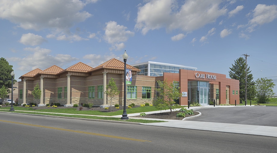
This image is a photo illustration. Move your mouse over and off of it to see a direct "before-and-after" comparison with the original photograph. This shows how I can compensate for less-than-ideal conditions at the time of a site visit, through the use of various digital techniques. In this instance, the building was in an urban setting with a number of elements that interfered with seeing and understanding the creativity of the architect, such as the crooked utility pole, wires, imperfections in the pavement, a hose in the landscaping area, bare areas of grass, and so on. Yet, it was important to show enough context to tell a story about its urban environment, so I left in some of the imperfections of the pavement, a utility pole and some wires, a hint of the nearby limited-access highway, and a vehicle in the far-left parking area. |
Care House child advocacy center, Dayton, Ohio