|
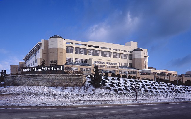
This image is a photo illustration. Move your mouse onto and off of it to see a direct "before-and-after" comparison with the original photograph. This shows how I can compensate for less-than-ideal conditions at the time of a site visit, through the use of various digital techniques. In this instance, a deadline for submitting this design to a competition was approaching in less than a week, and it happened to be in the dead of winter, so I had to go out on a cold morning, photograph this building while it was actually snowing, and count on making a pleasing image out of it later, digitally. The best angle on the building included trolley lines and a large pole; where they crossed the building and foreground, I had to "clone" them out. I chose a sky from my collection which complemented the building but did not dominate it, and which harmonized with the perspective of the building. I then masked various parts of the building, warmed up the color, and adjusted the luminance to better differentiate the various facets. Finally, I eliminated a number of distracting visual elements in the street, which drew the eye away from the main subject. |
Miami Valley Hospital, Dayton, Ohio