|
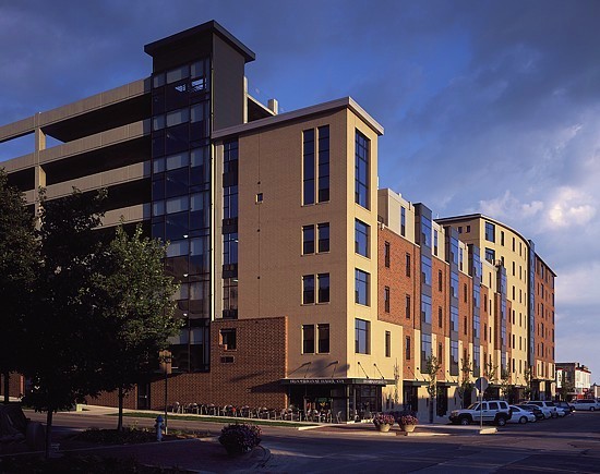
This image is a photo illustration. Move your mouse onto and off of it to see a direct "before-and-after" comparison with the original photograph. This shows how I can compensate for less-than-ideal conditions at the time of a site visit, through the use of various digital techniques. In this instance, one of the best angles on the building included a utility pole, wires, a prominent, crooked stop sign, and a conspicuous car (in the bottom-left corner), all of which interfered with seeing the building. Also, while the blue sky was not objectionable, I felt there was room for improvement, so I put in a different evening sky. This is an example of taking a shot that was already pretty good and making it "sing," through the judicious use of digital photo illustration techniques. |
Regester Building, Bloomington, Indiana